Why are we ashamed of toilets?

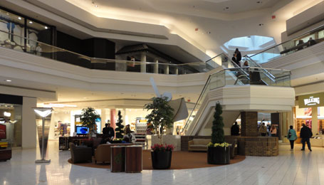
There is a spacious and attractive indoor mall in Chicagoland suffering from a pandemic problem that challenges interior designers regularly.
How should restrooms be incorporated into shared spaces?
This question ends up being answered directly or indirectly by designers of malls, theaters, restaurants, shops, etc.
No matter what primary products or services are provided in the space, if even small numbers of people are expected to spend time in the space, there need to be bathrooms. The bathroom design can either be thought-out and intentionally aligned with this critical need of the people; or the bathrooms can be an afterthought, an inharmonious side note.
Why is this well-known, critical user need being ignored? Designers? Where else in good design can you find well known and understood needs that are routinely ignored?

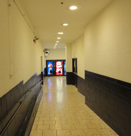
The bathrooms in this mall are down a long dingy hallway, about five hundred feet away from the dining tables. To access the bathrooms, one must pass under the hanging blue square sign in the picture above and down this ugly hallway into the utility portion of the building.

I wonder what percentage of the people who visit the mall any given day end up using one of the bathrooms? Why the huge shift from beautiful design to ugly design?
Everyone has to go to the bathroom sometimes. Why are we ashamed of them, hiding them away down a back hallway?

As a former employee of a store at this particular mall (therefore someone who has spent a large amount of time in this locale – even in this wing), I can tell you that being ashamed of restrooms has nothing to do with it. Practicality and commerce are at play here, the bathrooms are simply down a long corridor because they are behind the stores. One goes to a mall to visit retail establishments, not to go to the bathroom. Because of this, prime space is given to stores, and the bathroom (a recognized necessity) takes a literal backseat.
Btw, in this same wing there are also restrooms right next to an exit to the upper level of a parking garage. These restrooms have polished marble, clean tile, and are relatively nice and unapologetic.
@ Joel
Thanks for stopping by and sharing your thoughts. It is great to get input from someone who has spent a lot of time in this space.
I think you’re right about the way the space is arranged, stores in front and bathrooms behind. I just don’t think it’s the best arrangement. Furthermore, just because they are put off to the side, why not make this hall that will be frequently used fit the decor and style of the rest of the mall?
I am glad to hear that somewhere in the mall they have followed the theme in the restrooms.
BTW, I don’t think it is just this mall or even just malls. I think it is odd in general how often the bathroom is an afterthought or an uncelebrated necessity.