One flush or two?
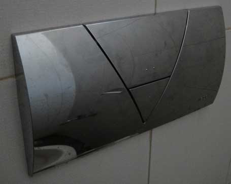
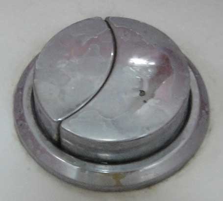
Many toilets are designed with a dual-flush system. One flush lever meant to be used for liquid waste (which requires less water) and one flush lever meant to be used for solid waste (which requires more water).
Here are a few examples:
In these two designs (as well as most others I have seen) the smaller button is for liquid waste (less water) and the larger button is for solid waste (and more water).
So here is the design challenge:
Given that this device is meant to be energy / resource saving, by helping to conserve water, how can we resolve the following paradoxical situation?
We prefer that the user use the smaller button (expending less water) as often as possible, and only use the larger flush when necessary. However, the larger button is easier to use, simply because it is bigger.
The current design allows the user to quickly intuit which button releases more water (bigger button = bigger flush), but it does not address the fact that people will tend to use the easier option (bigger button) more often, which is counter to the design intent.
How can we redesign the flush levers such that we still know intuitively which button releases which amount of water, while making it clear that the less water option is the preferred option if possible?
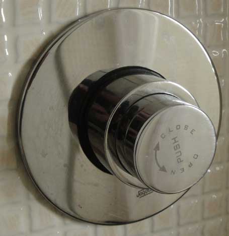
This last picture is actually a single-flush option, but I provided the picture to perhaps provide some design inspiration.


Simplest solution –
Write Whizz on one button
Write Dump on the other button.
Or whatever nomenclature one would prefer using. No.1 and No.2 would be good too 🙂
@ Nikhil
Thanks for stopping by and chipping in this idea. I think you’re right that this would simplify the understanding of which button is to be used for which type of waste. I don’t see, however, how it would push the user to prioritize the button for #1 more as the default.
And as you indicated, there might be some trouble in “universalizing” this solution!